Self Driving Car App Design
UI/UX Case Study on Zoomcar — Self-driving car rental app.
![]()
Driving a car is fun and going on road trips is amazing, but when it comes to paying EMIs and maintenance bills it feels like a burden. So, here is a solution — Zoomcar.
Zoomcar is a self-drive car rental company that provides car on-demand and operates in 27 different cities in India. Founded in 2013 with its headquarters in Bengaluru, Zoomcar is now booming with a 31% increase in revenue.
Reading this news, I was eager to dive deep into the UI/UX of the app study the services that Zoomcar provides.
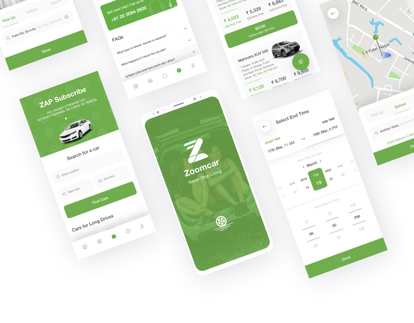
My Goals
- Use UX Research methods to understand problems that users face on the app.
- Understand these problems and provide a solution considering the data obtained from UX Research methods.
- Improve the user experience of the app and make it more seamless.
- Build prototypes and test it with users.
User Interviews
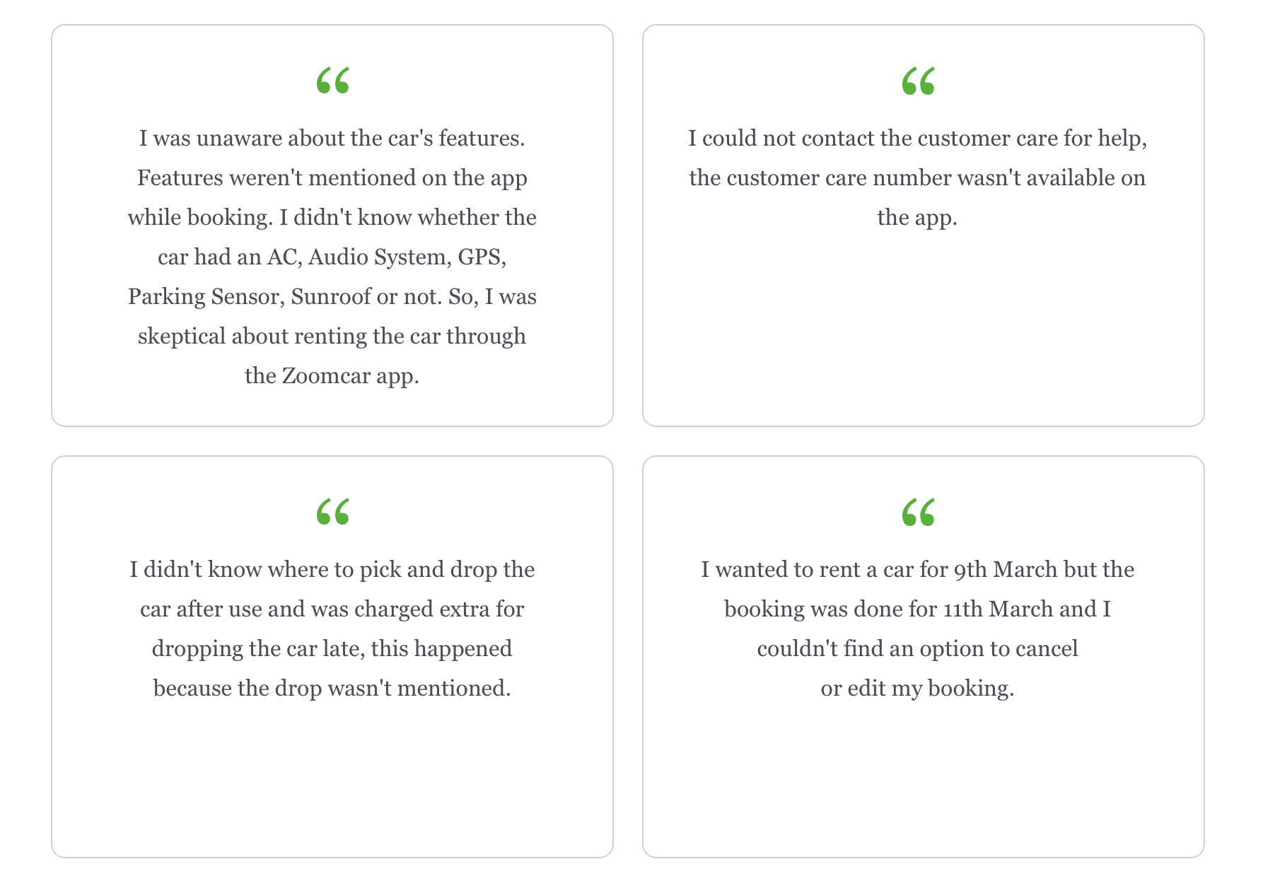
I starte d by conducting user interviews. Called up a few friends and asked if they have rented a car through Zoomcar or any other app. I spoke to 5 people and here are some quotes they mentioned:
Heuristic Usability Test
During the interviews, I also did a Heuristic Usability Test to measure the usability index of the app. I gave them scenarios like:
Scenario 1: You are planning for a road trip to goa (everyone does, but this seldom ever happens) and you want to book a car which is a 5 seater and has a sunroof and audio system. You want to book it from 5th — 12th April. Book the car and tell me how much it costs and the rate/km.
Scenario 2: You had rented a car last month to go on a road trip. Show me how much you spent on that car.
Scenario 3: Your refund is pending try calling customer care to check on the status.
Pain Points
Post interviewing users and heuristic testing, I summarised the data and developed the following considerations:
- The information on the app was insufficient, hence the users had to try calling customer care but couldn't find the number/option to connect with customer care.
- Users had to face inconvenience because the features weren't mentioned and sometimes the car didn't have an audio system and AC (Imagine going on a road trip in this car)
- It took longer to select a car of a specific preference because cars could be only filtered by body type.
- Booking and Cancellation issue.
Wireframing
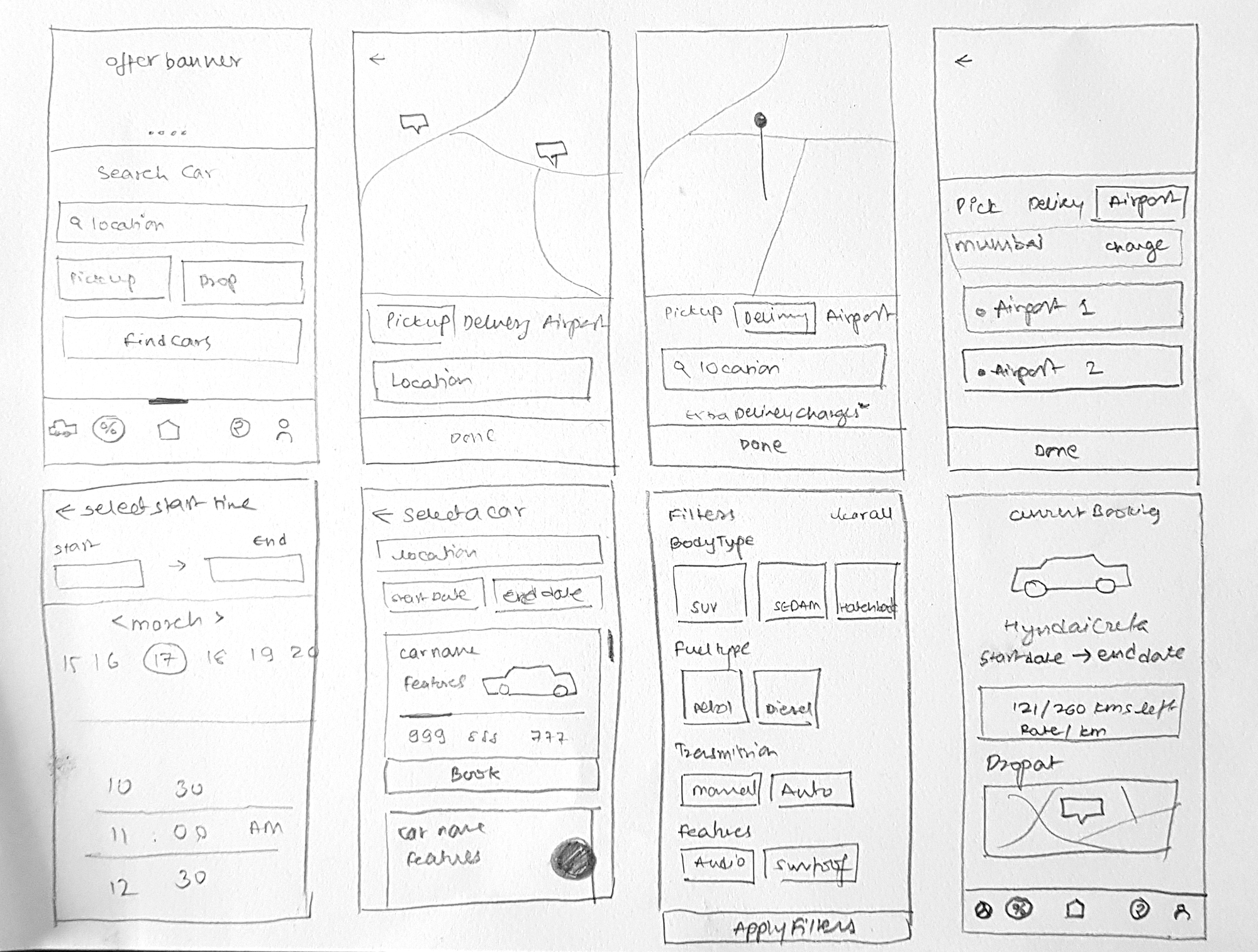
After gathering all the necessary information I started sketching out the wireframe on paper and tried to come up with a solution for all the pain points and took feedback on it. I also made changes to the wireframe according to the feedback. Here is the final paper wireframe.
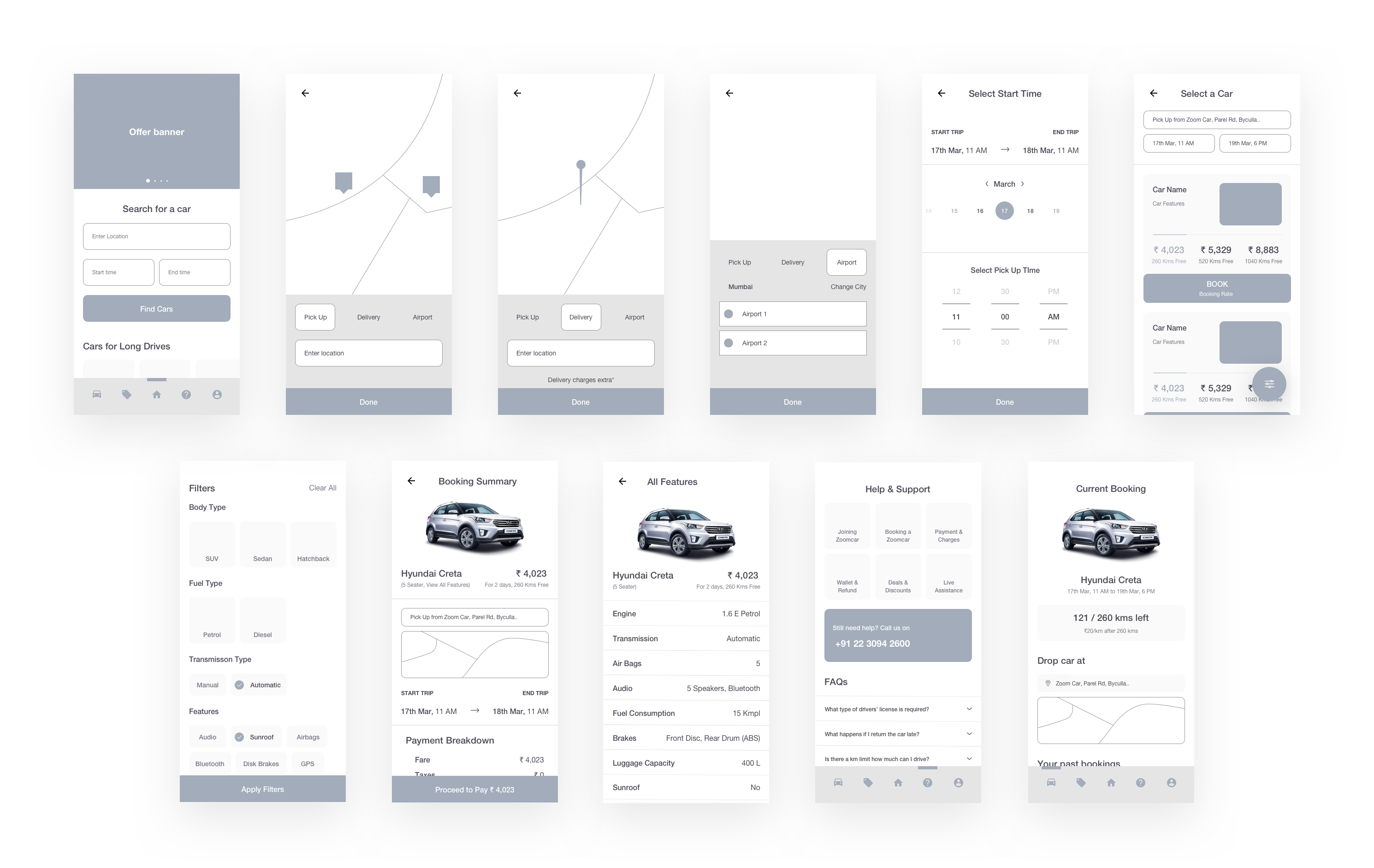
Once paper wireframe was ready I jumped to sketch to make high fidelity wireframe and connected them with the prototyping tool to check the task and user flow.
Prior to designing the app, I wrote down a set of design principles to follow.
1. Keep it simple
I wanted the app to be simple to use and no user needed to learn a new pattern.
2. Keep it clean
Aesthetic designs are more intuitive, hence using good typography, clean design with lots of white space was essential.
Design
While redesigning the app I kept in mind that phones are getting taller (I use a Note 8) and it gets difficult to reach to the top portion, so I positioned interactive components, buttons, sliders on the lower or the middle portion of the screen.
• New Home Screen
The main function of searching for a car is more prominent in the new design, the CTA stand bold and users know where to tap.

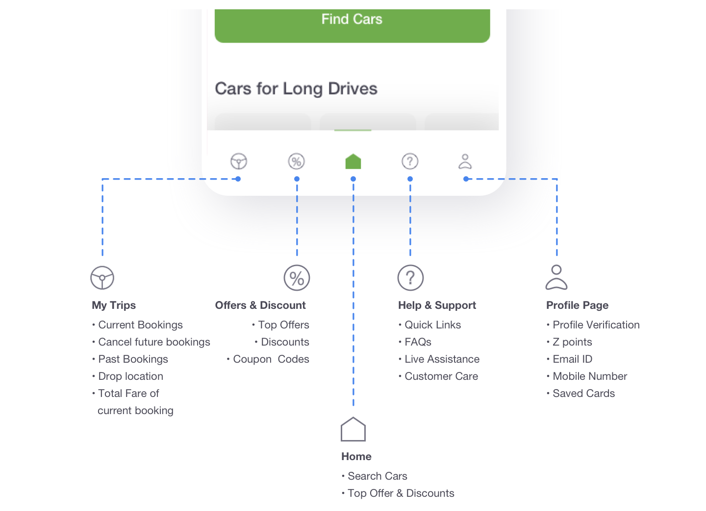
• Bottom Navigation
This bottom navigation was extremely helpful for the users. They could switch between top-level pages in a single tap.
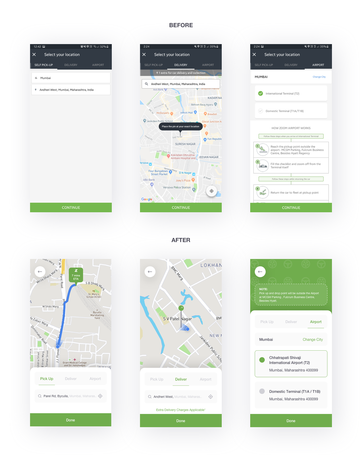
• Selecting Location
Here I placed all the components to the bottom of the screen, nearer to the fingers so that it is easier to reach. All my users liked this and it was easy for them to use and understand.
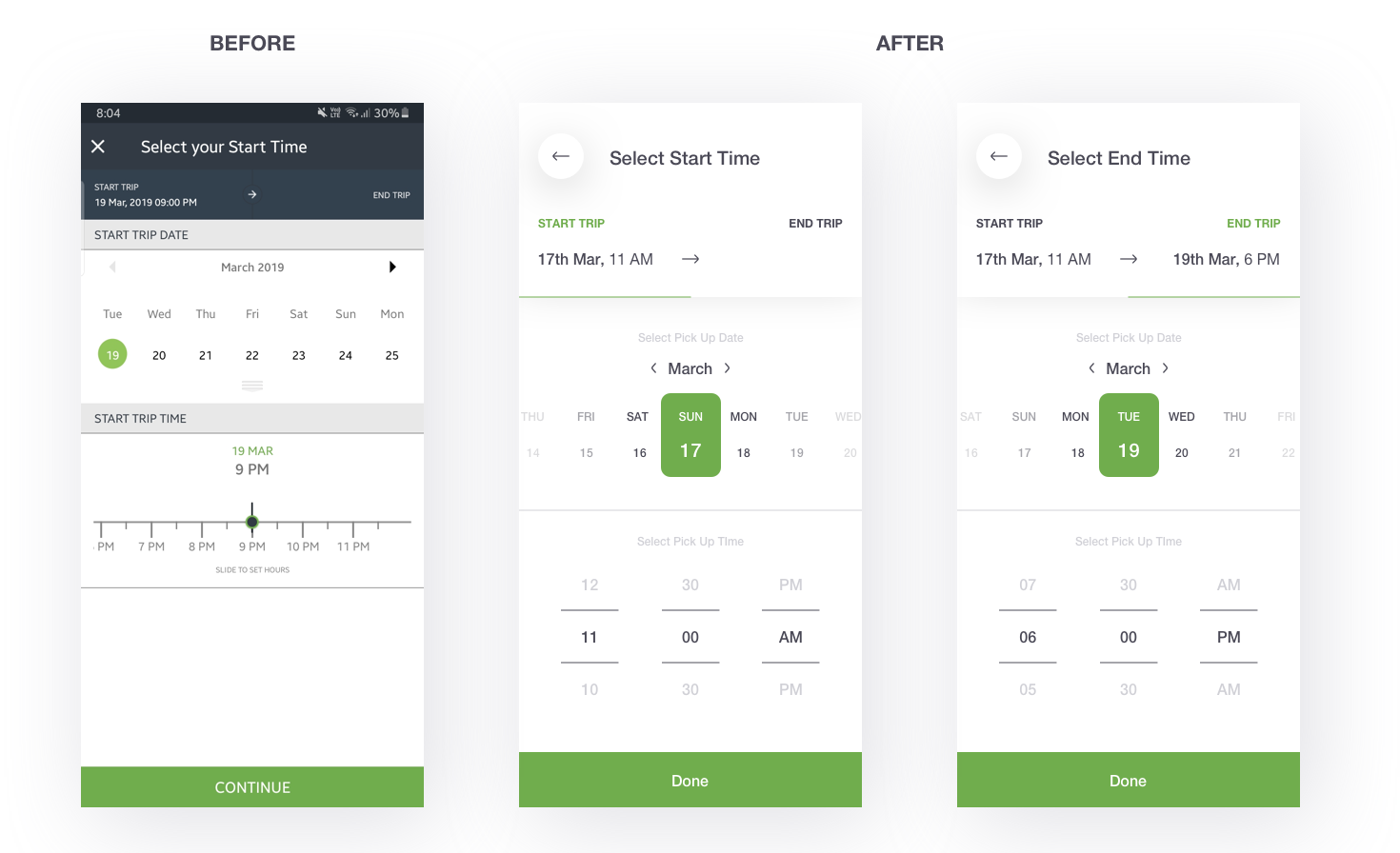
• Selecting the Start & End date
In the previous design, you had to select the Start date & time → Press Continue → Tap on End trip (On home page)→ Select the End date & time → Continue (Users were unnecessarily sent back to home page when the function was incomplete). I made some changes to this, you can now tap on End Trip and Start Trip to toggle between them.
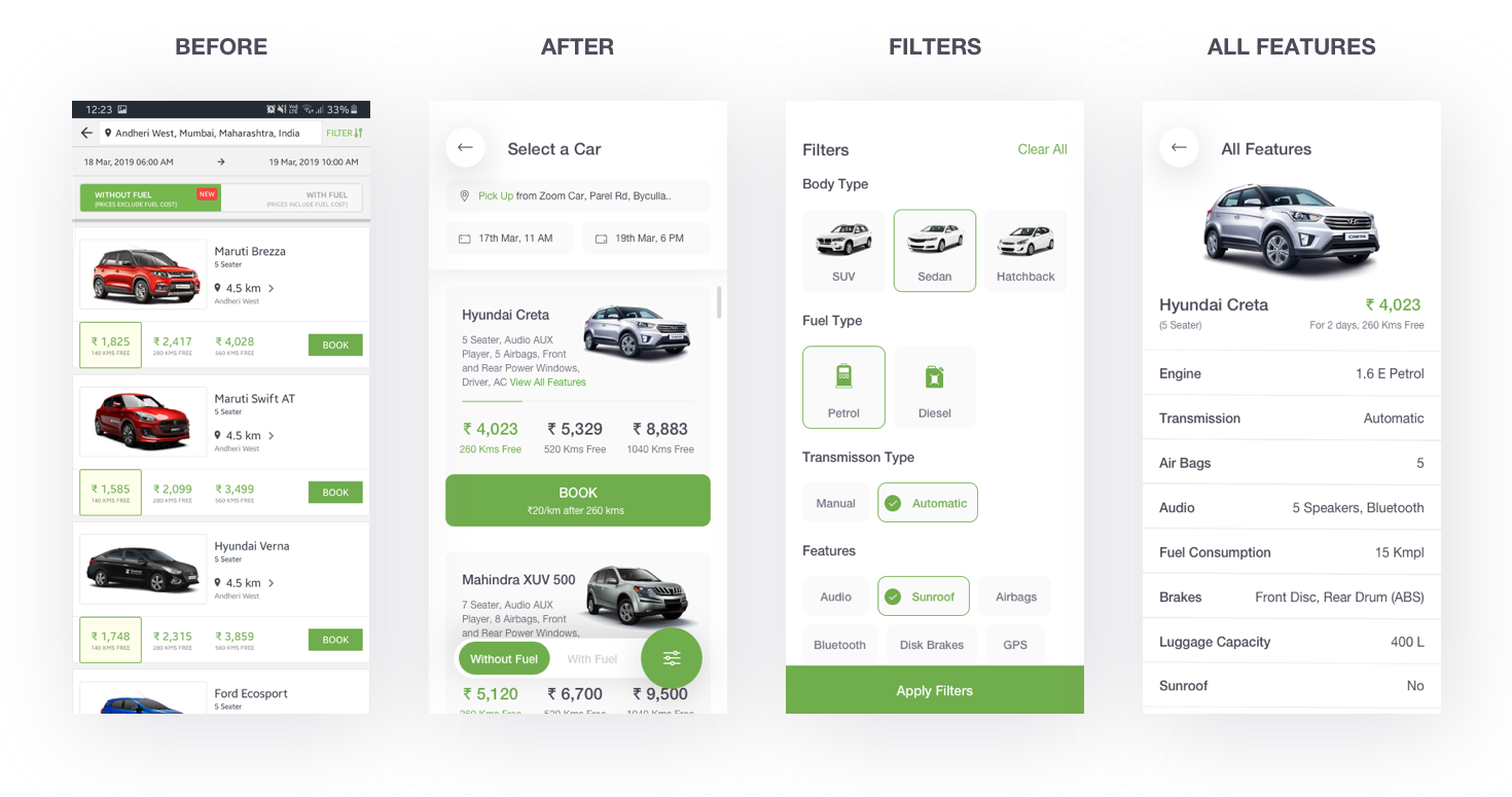
• Car Listing Page, Filters & Features
Card Listing: Earlier, the CTA had no priority it was so tiny. That's where you get conversions from and that's where you want people to tap so, I made it big and bold. Added some features below the name of the car so the user knew what he could expect when the car arrives.
All Features: View All Features take you to a page where you can see all the features of the car.
Filters: This is to tailor the search results according to users needs. Initially, the user could only filter cars through Body Type.
• Help & Support
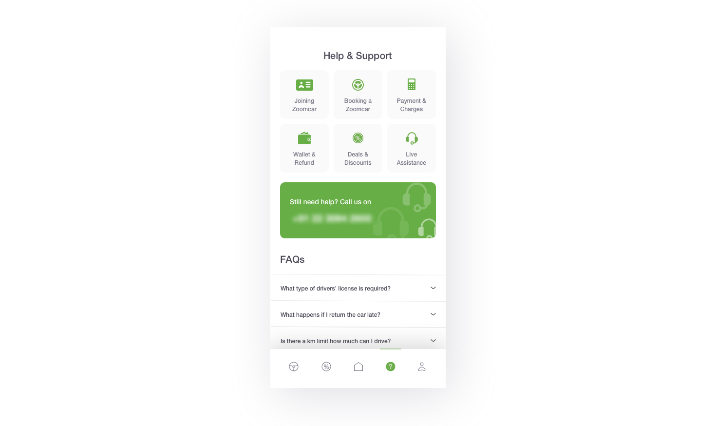
Almost all the user I spoke to complained about the difficulties of getting in touch with customer care and the solution was unresolved. Hence, I made the contact number prominent on this page so that if people face any problems they can quickly get it resolved. We also have FAQs which were there earlier as well.
• My Trips
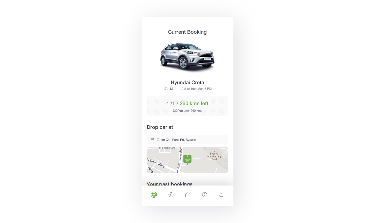
This page shows you current, future and past bookings that user made through the app.
User Feedback
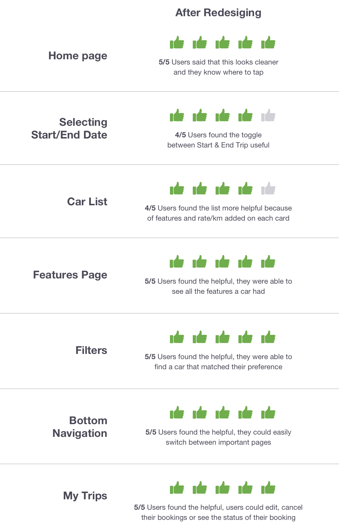
After designing all the pages, I built a prototype on Invision to share it with my users and got their feedback. Here is how they feel about these features:
My Learnings
This UI/UX exercise helped me improvise my UX research techniques, and my abilities to understand my users' problems and find appropriate solutions for them. Through user research, I understood that each user has different needs and requirements and you have to find common patterns. These patterns will help you to solve the problem at hand.
Thanks for reading
If you have any feedback or you would like to say hello, then shoot me a message on akshaysalekar17@gmail.com or connect with me on Instagram, Dribbble, LinkedIn, Behance.
Check out this case study on Behance and some shots on Dribbble.
Self Driving Car App Design
Source: https://blog.prototypr.io/ui-ux-case-study-on-zoomcar-92bcecf93032
Posted by: weberneart1942.blogspot.com

0 Response to "Self Driving Car App Design"
Post a Comment