Designing An App With Bootstrap
Utilizing Bootstrap for "Mobile First" Development
![]()

According to Cisco's Annual Internet Report, it is projected that over 70% of the global population will have mobile connectivity by 2023. That is about 5.7 billion people that will be viewing web apps on very small screens.
With this shift in how people access information on the internet, there has been a huge focus on "mobile first" development. Fortunately doing responsive mobile first approach is supported by many modern front end web UI frameworks. One of them is Bootstrap.
Bootstrap is described as a tool to "quickly design and customize responsive mobile-first sites." It was created by two guys from Twitter, Mark Otto and Jacob Thornton. They originally designed Bootstrap for their own internal use. In 2011, they released it for the rest of the web development community to use for consistent website design.
There are several key concepts that come built in with Bootstrap that aid in responsive web development and design.
Grid System
The Bootstrap grid system takes advantage of the CSS Flexbox layout. This enables simpler and more flexible layout options. Bootstrap's grid system uses a series of built-in container, row, and column classes to layout and align content.
We can utilize Bootstrap's grid system by applying a built in container class to the outermost element.

Inside this fixed width container, the content will be laid out in rows.

And within each row, content can be laid out using columns. Each row in Bootstrap is divided into 12 equal sized columns. Built-in col class can be used to specify how many columns in a row each piece of content will occupy.
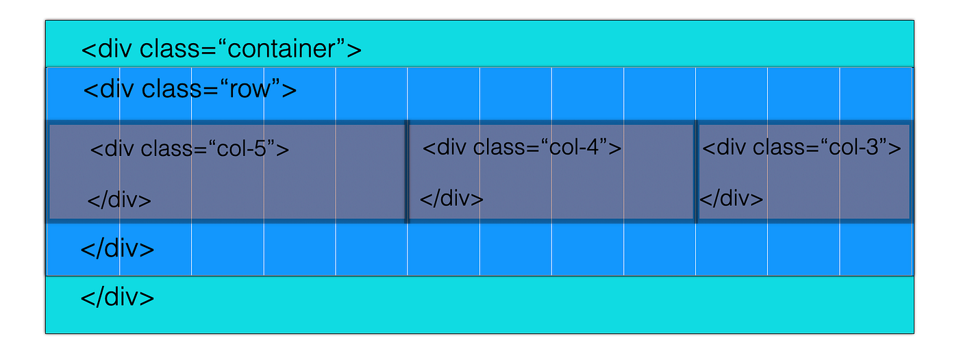
And within these inner columns, inner rows can be nested, which can then encase additional columns to lay out inner contents.
Fluid Images
Images in a website should automatically adapt itself to the screen size. Bootstrap provides a pre-built class that can be utilized to further enhance the way images are rendered in a webpage, making it responsive to different screen sizes. Images in Bootstrap are made responsive with .img-fluid. This class makes an image scale with its parent element.
Media Queries
Media query is a CSS technique introduced in CSS3. It allows for certain block of CSS properties to be included if a certain condition is true, using the @media rule.
For example, we can specify for the background color to be lightblue, if the browser window is 600px or smaller.
          @media only screen and (max-width: 600px) {
            body {
            background-color: lightblue;
            }
}
To ensure our web app's responsiveness throughout multiple device screen sizes, we would have to write several lines of CSS code to specify certain breakpoints.
Bootstrap simplifies this with pre-established media queries that are divided into six default breakpoints. Each breakpoint have its own container and can be tagged on to a unique class prefix and modifier.

With these concepts, we can easily integrate Bootstrap into our app using pre-built classes.
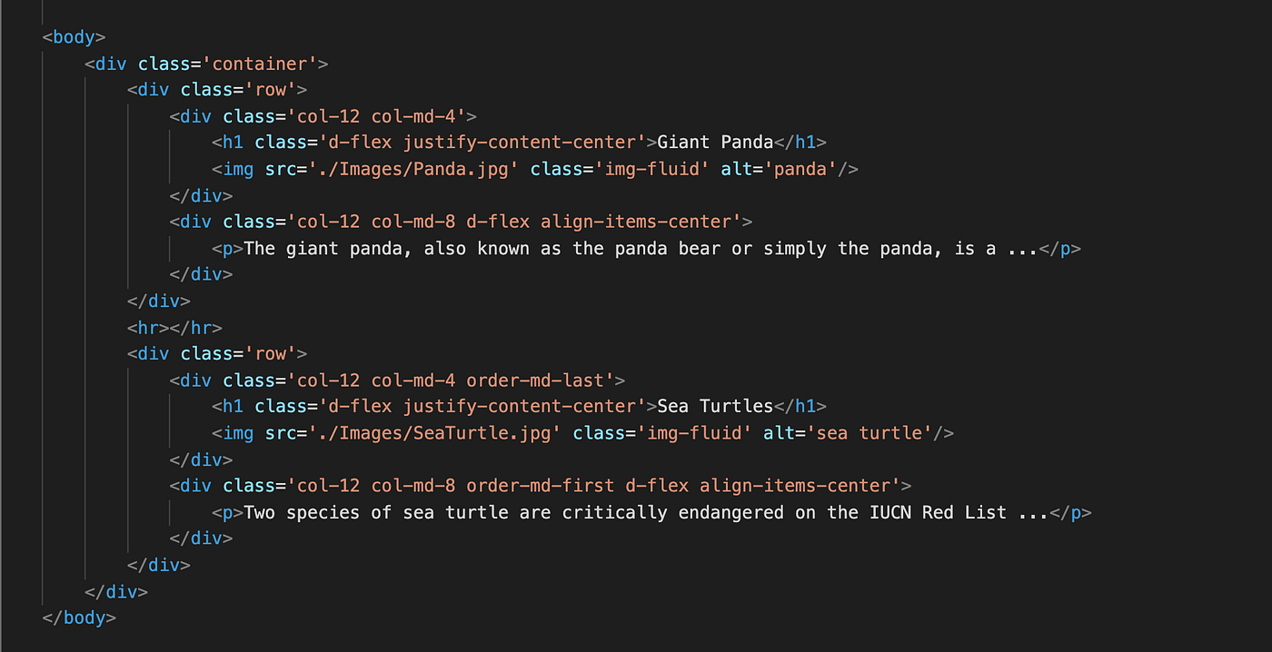
The above code will render a webpage like this on a mobile device.
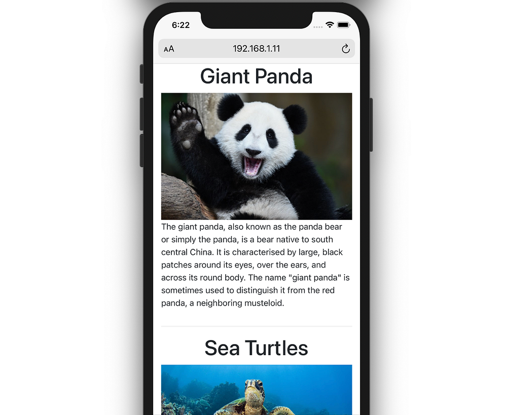
You'll notice that the first class added to every innermost div is "col-12". This is to specify that when the screen size is extra small (min-width of 576px or less), the column will occupy the entire row (all 12 columns).
In the h1 tags, we utilized the "d-flex" as well as the "justify-content-center" classes. These are built in utility classes to horizontally align the content.
Specifying breakpoints in the columns with "col-md-[number of columns]", will adjust the way the elements will be rendered on medium (and above) screen sizes. Adding "order-md-last" or "order-md-first" will control the visual order of the content starting from the medium breakpoint.
The same page will be rendered on md-xl screens (e.g. computer screens) like so:
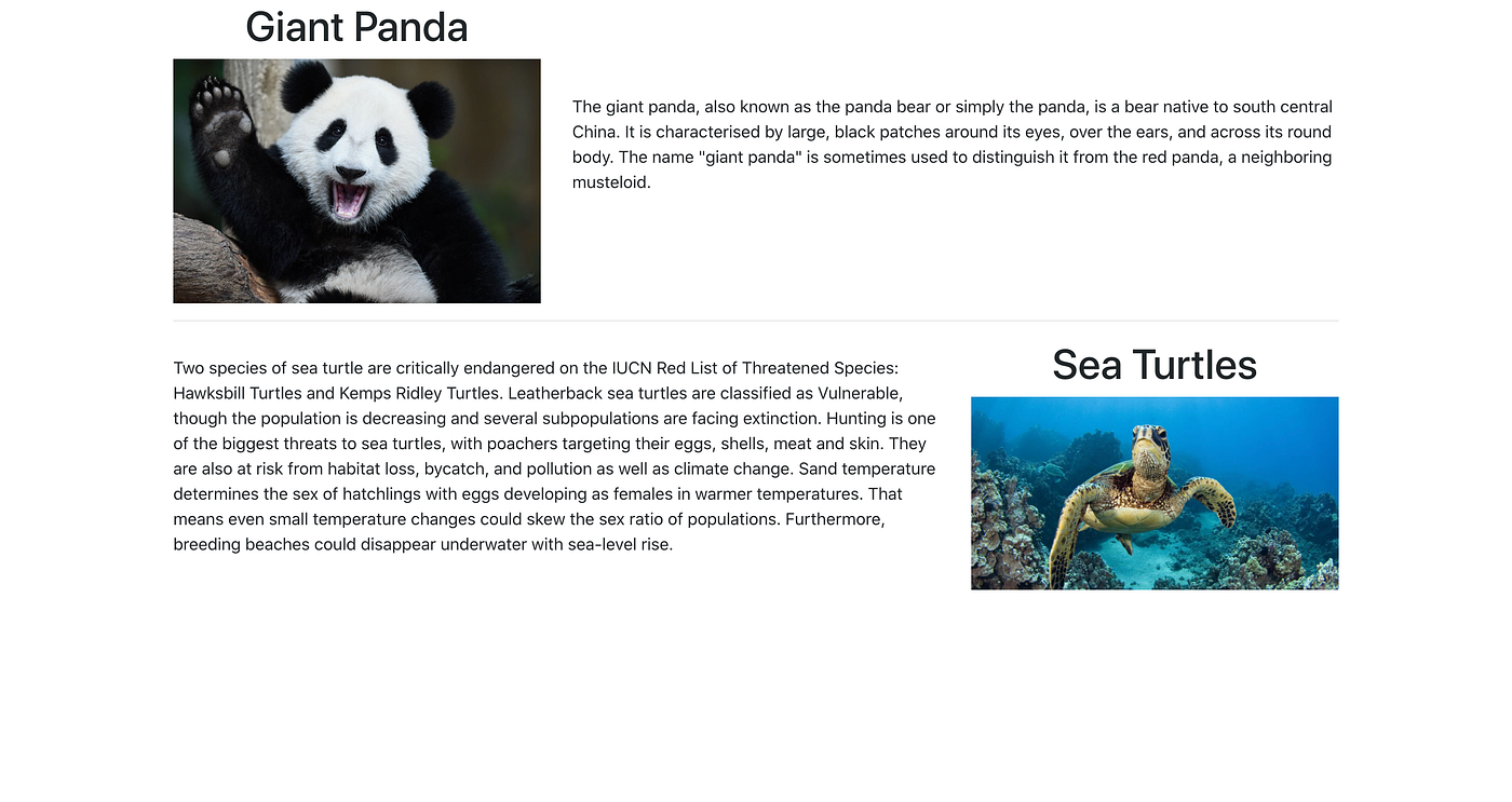
(Notice how the image div and the text div for the sea turtle are switched. This is due to our use of the " order " classes)
Without having to write any line of CSS, it is easy to configure the layout of a page using Bootstrap and make it responsive.
Additional advantage of using Bootstrap are as follows:
Easy to Use and SetUp
Whether you are an expert or a beginner developer, you can easily install and utilize Bootstrap. To link your HTML document to Bootstrap, you simply need to add the bootstrap stylesheet, before all other stylesheets, inside the <head> tag.
<link href="https://cdn.jsdelivr.net/npm/bootstrap@5.0.0-beta1/dist/css/bootstrap.min.css" rel="stylesheet" integrity="sha384-giJF6kkoqNQ00vy+HMDP7azOuL0xtbfIcaT9wjKHr8RbDVddVHyTfAAsrekwKmP1" crossorigin="anonymous"> And the following script tag near the end of the page, right before the closing </body> tag, to enable Bootstrap's Javascript and Popper dependencies.
<script src="https://cdn.jsdelivr.net/npm/bootstrap@5.0.0-beta1/dist/js/bootstrap.bundle.min.js" integrity="sha384-ygbV9kiqUc6oa4msXn9868pTtWMgiQaeYH7/t7LECLbyPA2x65Kgf80OJFdroafW" crossorigin="anonymous"></script> If you are working with Node.js powered apps, installation is a matter of running the code below in your terminal.
$ npm install bootstrap@next As previously demonstrated, utilizing Bootstrap's pre-defined classes is a matter of adding those class names in the elements you want to apply the behavior or properties to.
Customizable
If you are not satisfied with Bootstrap's design template, or you simply do not want that easily recognizable Bootstrap look, you can always do some customizations by tweaking the CSS file. You can also combine it with your own design and make them complement each other's functions.
For example, Bootstrap comes with 8 theme colors that can be utilized as background colors for elements.

If you are not quite happy with the darkness of the Dark option, you can add a Black background option by simply writing CSS code like this:
          .bg-black {
            background-color: #000000;
}
Additionally, the entire Bootstrap 4 CSS source is written in SASS. If you are using SASS in your application, you can easily customize some of Bootstrap's built-in variables.
(More information about customization can be found in Bootstrap's customization page or this very detailed article .)
React Components
If you are working with React, there is a React Bootstrap library available! It comes with true React components that are responsive. As one of the oldest React libraries, React-Bootstrap has evolved and grown alongside React, making it an excellent choice as your UI foundation.
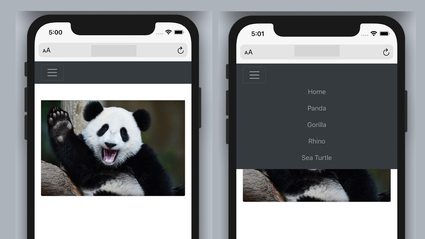
In my previous post , I utilized the Navbar component in react-bootstrap to create a responsive navigation for my app.
Designing An App With Bootstrap
Source: https://medium.com/swlh/utilizing-bootstrap-for-mobile-first-development-f85c8b65118a
Posted by: weberneart1942.blogspot.com

0 Response to "Designing An App With Bootstrap"
Post a Comment